
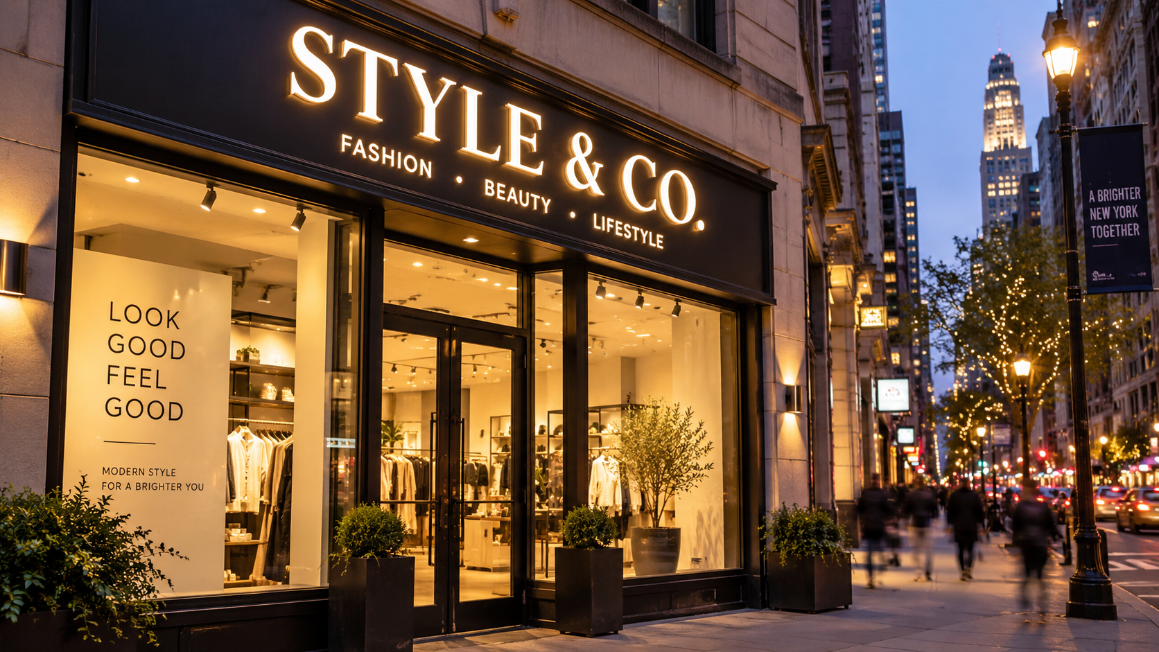
A shop owner in Queens once told a contractor her location was perfect. Good foot traffic, close to the subway, decent parking down the block. Except nobody walking by noticed the store. The sign was small, the lettering blended into the brick, and half the block genuinely had no idea what she sold in there. It happens more than people assume. A great location can still get ignored if the sign attached to it isn’t doing its job. Below are ten sign ideas worth thinking through, along with some notes on what to weigh before picking one.
1. Bold Storefront Signs
Your storefront sign carries most of the weight. It tells someone in about two seconds whether to slow down or keep walking. Size gets underestimated a lot. A sign can look perfectly fine up close, in the shop, on a laptop mockup, and still be tough to read from across the street. That gap between “looks good on screen” and “reads well from thirty feet” trips up more business owners than you’d expect.
2. Illuminated Signs
If you’re open past sunset, an unlit sign kind of vanishes. Restaurants, bars, pharmacies, even a 24-hour laundromat — anything running into the evening needs light on that sign, not just for reading it but because a dark sign reads as closed, even when the doors are open. Backlit channel letters are one option. A halo effect, where light glows around the edges instead of through the letters, is another. Neither is objectively better. It depends on the building and how much subtlety you want.
3. Dimensional Lettering
Flat printed signage can look a little thin next to raised letters, even with the same design underneath. Dimensional lettering picks up shadow throughout the day, and that shadow does a lot of the visual work. Dentists, attorneys, boutique shops — places that want to feel established rather than temporary — lean toward this option often. It costs more up front. It also tends to survive longer and photograph better, which matters more now that people snap a picture of a storefront before ever walking in.
4. Window Graphics and Vinyl Lettering
Most businesses have window space sitting there doing nothing. Vinyl lettering fixes that fast and cheap. A café can print its drink menu right onto the glass. A boutique might keep it simple, just a logo. A dental office downtown uses frosted vinyl on the lower half for privacy, plain lettering up top with hours and the practice name. None of this requires construction. And if the business changes direction next year, you peel it off and start over.
5. Blade and Projecting Signs
Flat signs mounted against a wall don’t get seen until someone’s already standing in front of the building — not much use on a narrow block where storefronts sit close together. Blade signs solve that by sticking straight out from the wall so people walking from either direction catch it early. Second-floor businesses use these a lot too, since there’s often no ground-level storefront to speak of. Sometimes the projecting sign is the only thing telling people the business exists at all.
6. Wayfinding and Directional Signs
Nobody enjoys wandering a building hunting for a bathroom or the right suite number. Office buildings and medical complexes rely on directional signage constantly, but it’s not just a big-building thing. Even a single storefront benefits from a small arrow pointing customers toward parking around back or a side entrance nobody expects. It’s unglamorous. It also removes a small annoyance that otherwise colors someone’s whole visit.
7. Branded Lobby and Interior Signs
There’s a difference between a sign that gets people through the door and one that confirms, once they’re inside, that they’re in the right place. A logo behind the front desk. A company name in raised letters down a hallway. Office buildings do this constantly, but plenty of smaller businesses use it too — a salon, a dental office, a studio where the interior experience is just as important as the storefront outside.
8. Promotional and Seasonal Signs
Permanent signage isn’t the only thing worth investing in. A weekend sale, a seasonal menu, an open house on Sunday — these call for something temporary. Window clings, sidewalk A-frames, banners. None of this replaces the main sign out front. It just adds a layer on top when there’s something specific worth pushing that particular week.
9. Custom Wall Signs and Graphics
Interior walls get treated like decoration when they’re really doing branding work. A restaurant might put a mural-style graphic near the host stand. A gym could paint a mission statement across a wall that would otherwise sit blank. An office might use a wall sign in the room where clients actually meet the team. This kind of signage gives a space personality, and it gives people something to look at, and occasionally photograph, while they’re waiting around.
10. Custom Sign Concepts That Fit the Brand
Some signs don’t fit neatly into any category above. Metal and wood combined. A logo cut into an unusual shape instead of a standard rectangle. Backlighting that shifts color for different seasons or events. These cost more and take longer to build. They’re also usually the ones people remember and bring up to a friend later, which counts for something on its own, even without a way to measure it.
How to Choose the Right Sign for Your Business
There isn’t one right answer here. It comes down to a handful of things.
Location matters — a sign on a busy avenue needs to work at a different distance than one on a quiet side street. Available space matters too, and whether the sign needs to work outdoors, indoors, or both. Lighting around the building affects whether illumination is worth the extra cost. Brand style plays into it as well: does the sign need to match a logo and color palette that already exists, or is this the moment to define one? Materials and durability come up too, especially outdoors where weather and wind take a toll over the years. Budget shapes all of it, obviously.
Installation is its own question. Some signs go up with minimal fuss. Others need permits, electrical work, or structural support that isn’t obvious until someone actually looks at the building. This is usually where talking to a signage company earns its keep — not because a business owner can’t handle it alone, but because a signage company doing this work daily tends to catch problems before they turn into delays.
Final Thought
A sign doesn’t need to be flashy to do its job. It needs to be visible, legible, and honest about what’s actually inside. Sometimes that’s a straightforward storefront sign. Sometimes it’s something more custom. Either way, the goal stays the same — get noticed by the people already walking past. If you’re weighing options for a New York storefront or office, Velement Worldwide works on exactly this kind of project, and a short conversation is usually enough to figure out where to start.