Custom Acrylic Letters in NYC
Laser-cut acrylic letters and logos for lobbies, reception walls and retail interiors. Solid color, painted, frosted, mirror and metallic finishes, cut and finished in our own workshop in New York and supplied with a mounting template so they go up straight.
Send us the logo and the wall size. We will tell you what thickness it needs and whether your font will survive being cut.
On a letter, you see the edge from everywhere
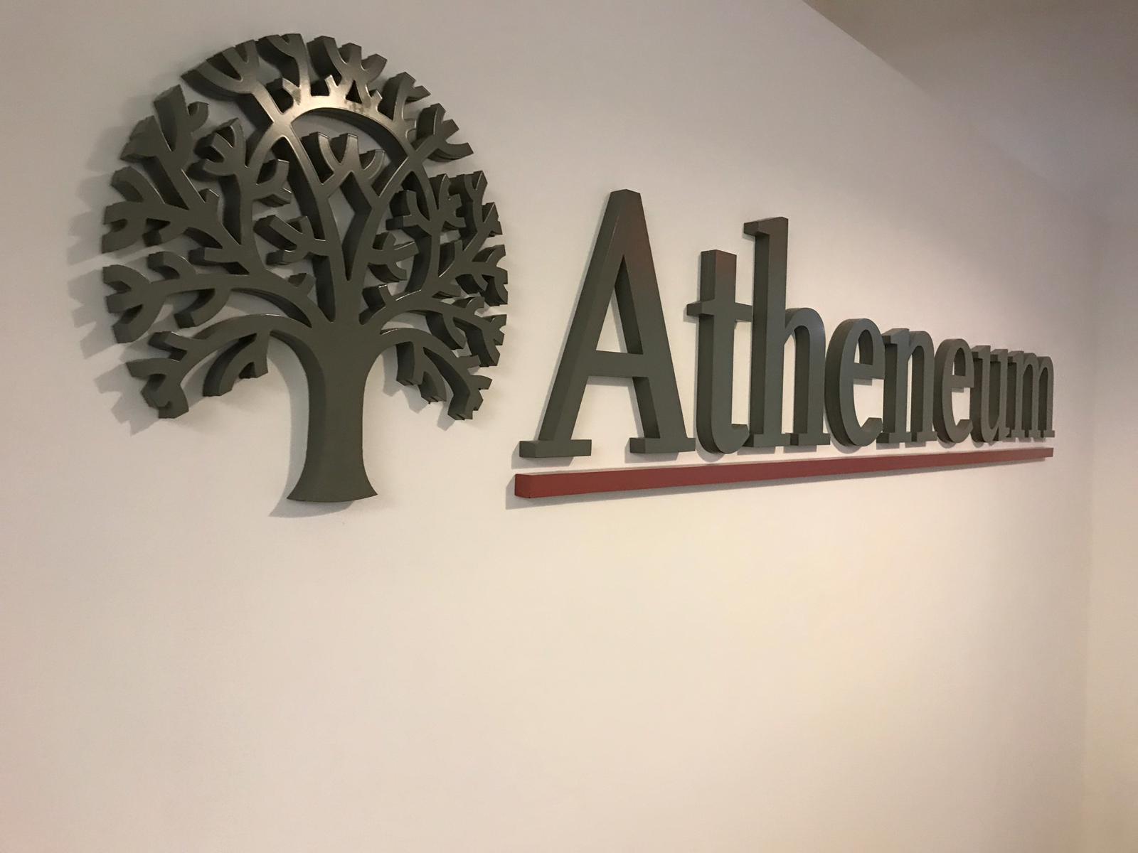
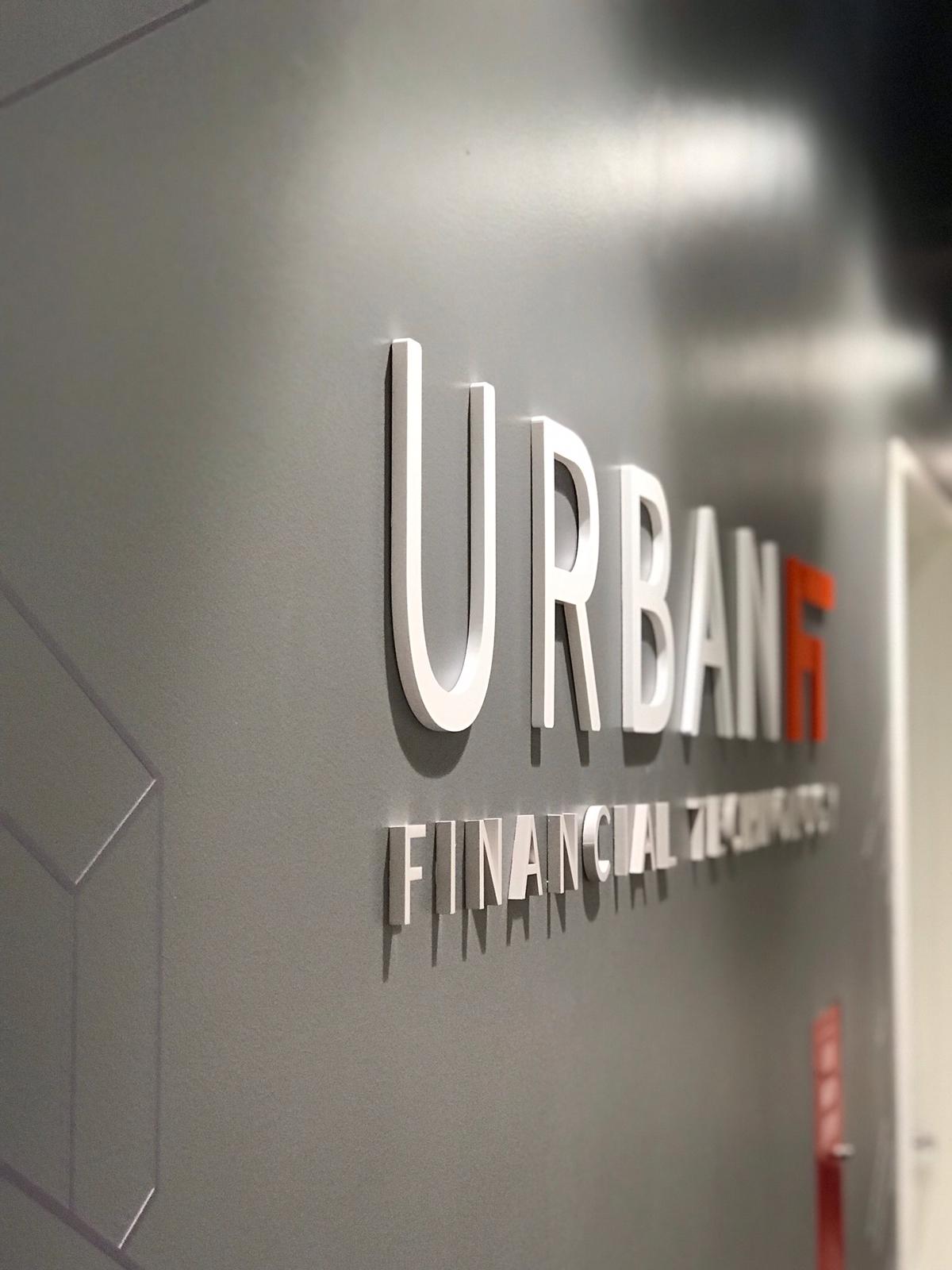
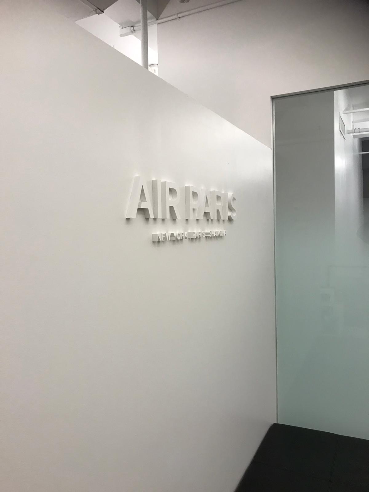
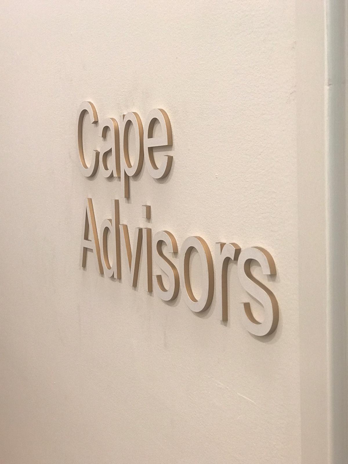
A sign panel shows you one face. You stand in front of it and you see the front. A set of letters is different: you approach from an angle, you walk past it, and from every position you are looking at the cut edges as much as the faces.
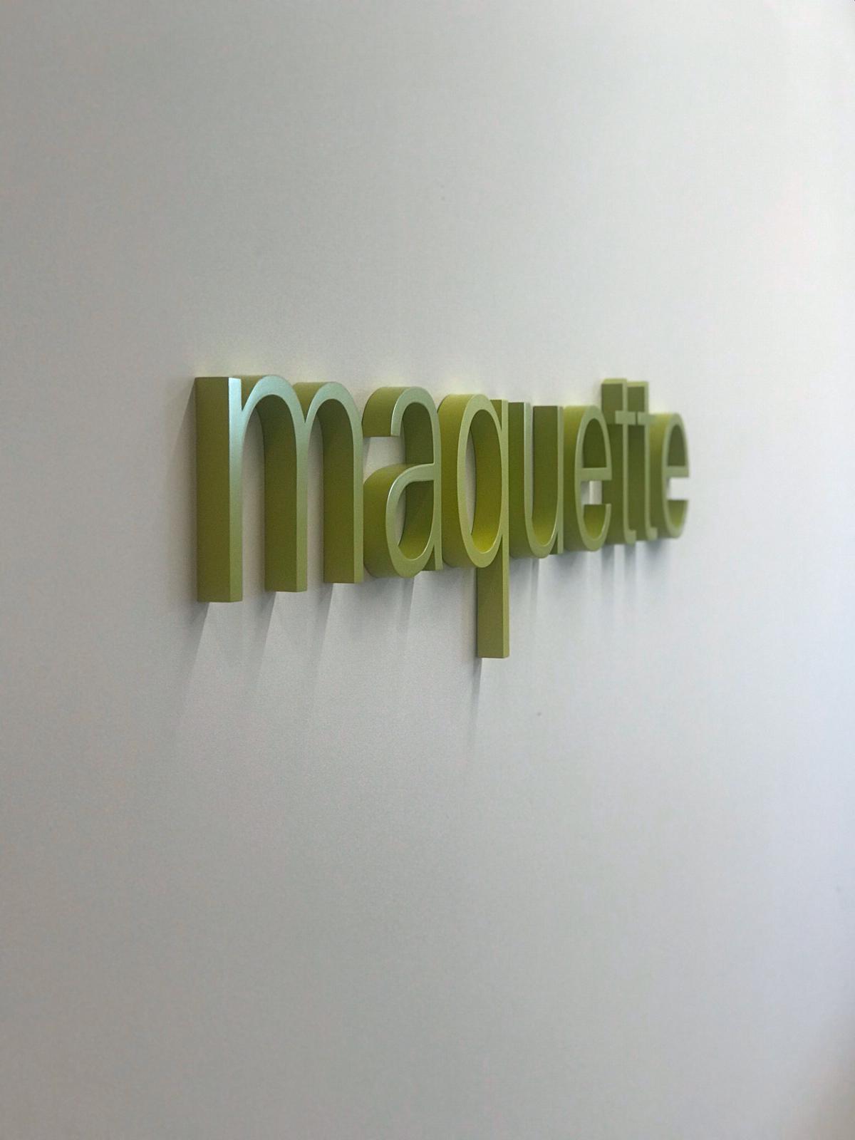
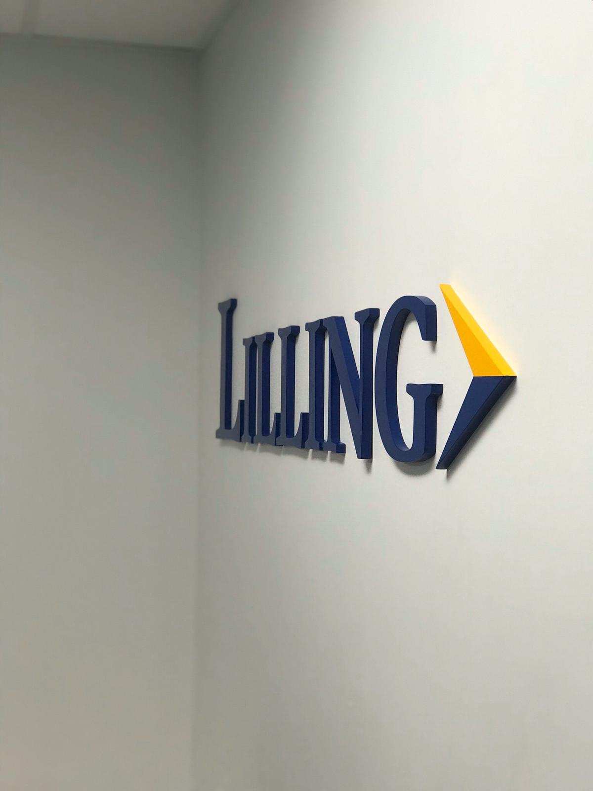
Which means the thing that decides whether acrylic letters look expensive is not the color and not the font. It is the edge, the thickness, and the gap between the letter and the wall. A quarter inch flat to the wall is a label. Three quarters of an inch held off it, with a clean polished edge and a shadow behind, is a piece of signage.
We cut, finish and pack these in our own workshop in New York, with the spacing template in the box.
Four ways to put letters on a wall, and how to choose
| Letter type | What it is | Choose it when | Page |
|---|---|---|---|
| Acrylic letters | Cut from acrylic sheet. Solid color, painted or metallic finish. Not illuminated. | Interiors, lightweight mounting, color accuracy, budget, or where metal is too heavy for the wall. | |
| Metal letters | Cut or fabricated from aluminum, stainless, brass or bronze. Not illuminated. | Where weight, patina and permanence are the point. Exterior work and high-end reception. | Metal letters |
| Backlit letters | Letters lit from behind so they glow onto the wall. Can be metal or acrylic. | Where the lighting is the effect. Reception walls, dark lobbies, anything meant to be seen at night. | Backlit letters |
| Channel letters | Fabricated letters with sides and an illuminated face or halo. | Storefronts and building exteriors, where the letters have to be read from the street. | Channel letters |
Thickness, edge, and how the color goes on
Thickness
Thickness is the first decision and the one most often made too thin. It controls how much edge you see, how much shadow the letters throw and, more than anything else, whether they read as a sign or as a sticker. It also has to suit the size: a large letter cut thin will look flimsy no matter how well it is made, and a small letter cut very thick looks like a block.
We will propose a thickness for your letter height rather than quoting whatever is on the shelf, and we can send samples if you want to see the difference in person.
Solid color, painted, or printed
There are three ways to get a colored acrylic letter and they behave differently.
| Method | How it works | What to know |
|---|---|---|
| Solid colored sheet | The color runs all the way through the material. | A knock or a scratch does not show a different color underneath. Limited to the colors sheet is made in. |
| Painted | Clear or white sheet, sprayed to a specified color. | Any color, including a brand match. A deep chip can show the material underneath, so it belongs above hand height. |
| Second surface | Clear acrylic painted or printed on the back, seen through the face. | A glossy depth that painted letters do not have, and the color is protected by the acrylic in front of it. |
Where a brand color has to be exact, we match and proof it before the letters are cut.
Finishes, including the metal look
The current page says acrylic letters can mimic metal, and that is true with an honest caveat worth printing. Mirror and brushed metallic finishes on acrylic read convincingly as metal in an interior, at normal viewing distance, at a fraction of the weight and cost. Close up, in raking light, they do not fool anybody, and they will not develop the patina that real brass or bronze does.
So the right way to choose them is not as a substitute for metal but as the correct answer to a specific problem: a partition wall that will not take the weight, a budget that will not take solid metal, or a letter high enough that nobody will ever be close to it.
Send it to us before you fall in love with it
This is the question nobody asks until it is too late, and it is the most useful thing on this page.
A letter cut from a sheet is a physical object and it has to hold together. A font with very thin strokes, fine serifs, or a script with hairline connections between characters will produce letters with fragile points that can break in handling, in packing or during installation, and that look weak even when they survive. The smaller the letters, the worse it gets, because the stroke does not scale in the way people expect it to.
- What we look at. The thinnest part of the letter has to be substantial enough to survive being handled. If it is not, the options are to go bigger, go thicker, or adjust the artwork.
- Scripts and joined letters. A script that joins letter to letter is often better cut as one continuous piece rather than as separate characters, which changes how it mounts and how it is spaced.
- Small counters. Counters, the enclosed spaces inside letters like O, A and R, can close up at small sizes or in heavy weights, which makes the word harder to read from a distance.
- Just ask. Send us the artwork and the letter height. We will tell you whether it works as it is, and if it does not, what the smallest change is that would fix it.
The part that decides whether it looks straight
| Method | How it works | Best for |
|---|---|---|
| Stud mount, held off the wall | Threaded studs on the back of each letter sit in drilled holes, with spacers holding the letter clear of the surface. | The premium option. The gap throws a shadow and is most of the effect. |
| Flush stud mount | Studs into drilled holes with the letter sitting against the wall. | Cleaner and tighter. Right where a shadow would be a distraction. |
| Adhesive mount | Heavy-duty foam tape on the back of the letter. No holes in the wall. | Smaller and lighter letters, leased space, temporary installs. Limited by weight and by the surface. |
| Mounted to a backer panel | Letters fixed to a panel, and the panel fixed to the wall. | Uneven walls, glass, and anywhere you want to install the whole thing in one piece. |
The template is not an optional extra
Every set of letters we send goes out with a full-size mounting template: the layout printed at actual size with the stud positions marked. It gets taped to the wall, the holes are drilled through it, and the letters go up straight and correctly spaced.
It sounds like a detail. It is the difference between a wall that looks designed and a wall where the spacing is visibly uneven, and uneven spacing on a lobby wall is permanent and impossible to stop noticing.
Where acrylic letters belong, and where they need thinking about
Acrylic letters are an interior product first. Indoors they are stable, hold their color for years and mount easily onto surfaces that would not carry metal.
Outdoors they can work, and they need more consideration than the current copy suggests. Two things change: acrylic gets more brittle in cold weather, and it expands and contracts with temperature more than the wall it is fixed to. A long word mounted rigidly across a facade in New York goes through that cycle every year.
- What we do about it. Mounting that allows a little movement rather than clamping every letter rigidly.
- Separate letters. Individual letters cope better than one long connected piece.
- When to use something else. For an exposed facade, a street-facing sign or anything that has to last a decade outside, metal letters or channel letters are usually the better specification, and we will say so.
Logo to wall
- Send the artwork. Send the logo or wording, the wall dimensions and the letter height if you know it. Vector artwork is ideal. If you only have a JPEG, send it and we will tell you what we can do.
- Font check. We check the thinnest strokes at your chosen size and tell you whether it works. See Section 5.
- Specification. Thickness, color method, finish and mounting, with samples if you want to see a finish in person.
- Layout. Drawn at actual size on your wall dimensions, so you can see the proportion and the spacing before anything is cut.
- Cut and finished. Laser cut, edges finished, studs fitted and everything checked as a set.
- Delivered. With the full-size mounting template, or installed by us.
Cut here, checked first, sent with a template
| Capability | What it means for your letters |
|---|---|
| We check the font first | Before anything is quoted, so a thin serif is a conversation rather than a broken letter in a box. |
| We cut them ourselves | Laser cutting in our own New York workshop, so the edge is part of the job and a reorder matches. |
| We specify the thickness | Proposed for your letter height rather than taken off the shelf. |
| We send a template | Full-size layout with the stud positions marked, so they go up straight. |
| We will tell you when to use metal | For an exposed facade, acrylic is often not the right answer, and we would rather say so. |
| We keep the specification | A matching set for the next floor or the next office is a repeat. |
Frequently Asked Questions About Custom Acrylic Letters
What are acrylic letters?
Acrylic letters are individual dimensional letters cut from acrylic sheet and mounted to a wall, usually on studs that hold them slightly clear of the surface. They come in solid colored, painted, frosted, mirror and metallic finishes, and they are the standard choice for lobby, reception and retail interior lettering.
Acrylic or metal letters: which should I choose?
Acrylic for interiors, for lightweight mounting on partitions and drywall, for exact brand colors and where budget matters. Metal for exteriors, for permanence, and where the material itself is part of the look. If the letters are going outside on an exposed facade, or somewhere people will be close enough to touch them, metal is usually the better specification and we will tell you so.
Will my font work as cut letters?
Send it to us and we will check. The issue is the thinnest part of each letter: fine serifs, hairline scripts and very light weights produce fragile points that can break in handling or installation, and it gets worse as the letters get smaller. If a font does not work at your size we will tell you the smallest change that would fix it, usually going larger, going thicker, or adjusting the artwork.
How thick should acrylic letters be?
Thicker than most people first choose, and matched to the letter height. Thickness controls how much edge you see and how much shadow the letters throw, and it is what makes them read as signage rather than as a label. We will propose a thickness for your size and can send samples.
How are they mounted, and will it damage the wall?
Most sets are stud mounted: small threaded studs on the back of each letter sit in drilled holes, with spacers holding the letter off the wall. It needs small holes, which are easy to make later. For lighter letters or leased spaces, heavy-duty adhesive mounting avoids holes altogether, within limits on weight and surface. Every set goes out with a full-size mounting template.
Can you match our exact brand color?
Yes. The acrylic sheet comes in stock colors, and for anything outside those we paint to a specified color and proof the match before the letters are cut. We keep the specification so a later set matches.
Can acrylic letters go outside?
They can, with the right mounting. Acrylic holds its color well but becomes more brittle in cold and moves more with temperature than the wall behind it, so exterior sets need mounting that allows for that. For an exposed facade or a street-facing sign meant to last a decade, metal letters or channel letters are usually the better choice.
Can you install them, or do we?
Either. With the template, a competent contractor can install a set straight. We also install, which is usually the right call for large sets, high-level work, or anywhere a mistake would be expensive to correct.
View Our Projects